
Pfrsantos little corner of complaints
-
Fixing the annoying floating footer now (hopefully) and then putting the light/dark switch on every page so you don't have to open threads to find it.
Enjoy the Entire Multitool.Org Universe:
SAKWiki.com
EDCTV.Org
GearFeed.Org -
The Main Site at Multitool.Org is offline and has been for a while, so that's why that link doesn't work.
The EDC-TV link doesn't work because it's .com and not .org, so that's an easy fix.
GearFeed is working, so that's an easier fix.
Need to add SAKWiki as well.
-
Fixing the annoying floating footer now (hopefully) and then putting the light/dark switch on every page so you don't have to open threads to find it.
root said:
Fixing the annoying floating footer now (hopefully) and then putting the light/dark switch on every page so you don't have to open threads to find it.
Let's see how the quoting looks like now.
Kinda weird. You get a small font line with the initial part of the post quoted on top and then the full quoted post below.
Isn't it a waste of space?
It is just a matter of time before they add the word “Syndrome” after my last name.
-
root said:
Fixing the annoying floating footer now (hopefully) and then putting the light/dark switch on every page so you don't have to open threads to find it.
Let's see how the quoting looks like now.
Kinda weird. You get a small font line with the initial part of the post quoted on top and then the full quoted post below.
Isn't it a waste of space?
Yeah, I haven't really gotten to the quoting issue yet, which is why you haven't seen anything change there significantly.
It's definitely on the list though.
-
root said:
Fixing the annoying floating footer now (hopefully) and then putting the light/dark switch on every page so you don't have to open threads to find it.
Let's see how the quoting looks like now.
Kinda weird. You get a small font line with the initial part of the post quoted on top and then the full quoted post below.
Isn't it a waste of space?
pfrsantos said:
root said:
Fixing the annoying floating footer now (hopefully) and then putting the light/dark switch on every page so you don't have to open threads to find it.
Let's see how the quoting looks like now.
Kinda weird. You get a small font line with the initial part of the post quoted on top and then the full quoted post below.
Isn't it a waste of space?
How's this for quotes now?
Enjoy the Entire Multitool.Org Universe:
SAKWiki.com
EDCTV.Org
GearFeed.Org -
pfrsantos said:
root said:
Fixing the annoying floating footer now (hopefully) and then putting the light/dark switch on every page so you don't have to open threads to find it.
Let's see how the quoting looks like now.
Kinda weird. You get a small font line with the initial part of the post quoted on top and then the full quoted post below.
Isn't it a waste of space?
How's this for quotes now?
root said:
pfrsantos said:
root said:
Fixing the annoying floating footer now (hopefully) and then putting the light/dark switch on every page so you don't have to open threads to find it.
Let's see how the quoting looks like now.
Kinda weird. You get a small font line with the initial part of the post quoted on top and then the full quoted post below.
Isn't it a waste of space?
How's this for quotes now?
How indeed ?
Have to scroll up to find the submit button. 🫤
-
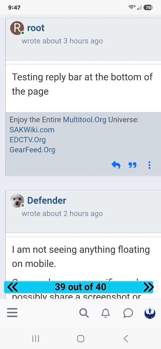
@root On mobile for the first time in a while. Is the floating post counter bar new ? It's a bit distracting.
The color theme is an improvement IMO

SteveC said:
@root On mobile for the first time in a while. Is the floating post counter bar new ? It's a bit distracting.
The color theme is an improvement IMO
I'll admit, I have been concentrating mostly on desktop for the moment, with only occasional checks on mobile.
I suppose I'm this day and age I should be doing it the other way around. Mobile has to work because many people don't have it use laptops most of the time.
-
Signature area should be smaller now. I can go a bit smaller if need be.
Enjoy the Entire Multitool.Org Universe:
SAKWiki.com
EDCTV.Org
GearFeed.Org -
Okay, I liked that, but if it's a pain I'll see if I can remove it too.
Enjoy the Entire Multitool.Org Universe:
SAKWiki.com
EDCTV.Org
GearFeed.Org -
Looking at our current mobile I guess we don't have post numbers either.
One thing I've noticed that we are missing here is when we are replying it would be good to be able to scroll up to look at the previous posts. We are able to do that on the current forum. This is handy if you need to review what you are responding to, also allows you to add post quotes.
-
Looking at our current mobile I guess we don't have post numbers either.
One thing I've noticed that we are missing here is when we are replying it would be good to be able to scroll up to look at the previous posts. We are able to do that on the current forum. This is handy if you need to review what you are responding to, also allows you to add post quotes.
@SteveC that is definitely on the list of things to do.
Right now I am working on a module for translating BBCode as the only pre-built one is 11 years old.
Insert freaking out smiley here.
I'm not using an 11 year old plugin.
Insert Thwack smiley here.
And it's a bit more complicated than I'd intended, but it's twenty years of forum posts and it's worth the effort.
When/if I manage to get anywhere with that I'll look at adding the posts to the reply screen- we definitely need that.
-
Looking at our current mobile I guess we don't have post numbers either.
One thing I've noticed that we are missing here is when we are replying it would be good to be able to scroll up to look at the previous posts. We are able to do that on the current forum. This is handy if you need to review what you are responding to, also allows you to add post quotes.
Okay, that's turning out to be a bigger job than I should start halfway through the day.
I'll tackle that tomorrow and see if I can get the posts to show up first
-
Okay, that's turning out to be a bigger job than I should start halfway through the day.
I'll tackle that tomorrow and see if I can get the posts to show up first
Thanks for all your hard work. I hope I'm helping with suggestions and not adding more grief to the process.




Hello! It looks like you're interested in this conversation, but you don't have an account yet.
Getting fed up of having to scroll through the same posts each visit? When you register for an account, you'll always come back to exactly where you were before, and choose to be notified of new replies (either via email, or push notification). You'll also be able to save bookmarks and upvote posts to show your appreciation to other community members.
With your input, this post could be even better 💗
Register Login


