
leatherman logo change
-
The Victorinox logo is an icon. Most people saw the Victorinox logo at the same time as the product so they are synonymous with each other. They also take pride in being Swiss made and it's a symbol of the Swiss.
The other two logos are not very good in my opinion, either as an example of graphic design or being iconic, they're not anything special.
-
@gregpost said:
The Victorinox logo is an icon. Most people saw the Victorinox logo at the same time as the product so they are synonymous with each other.I guess Leatherman are hoping their new logo will fare the same.
I think using the "L" is a good idea, you know it is a name beginning with L. It's like a Toyota "T" or a Honda "H".
The old logo could have been anyone's. -
Looking at these.... it seems Victorinox make first aid kits, Gerber makes swords, not sure what SOG makes...

I only buy 1st aid kits that get the logo right... Seriously, 99% has either the Swiss Flag or the Red Cross instead of the 1st aid symbol.

-
Dear God, that's hideous.
But why would anyone want to change a logo that's recognisable around the globe ??
Unless ofcourse it's really a identifier for items that are to be outsourced for manufacture...well you never know.Anyway, good news for all of us, our LM's will soon be identified as "Original Leathermans" :D
Oh smugness indeed!!
-
@tosh said:
Dear God, that's hideous.
But why would anyone want to change a logo that's recognisable around the globe ??
Unless ofcourse it's really a identifier for items that are to be outsourced for manufacture...well you never know.Anyway, good news for all of us, our LM's will soon be identified as "Original Leathermans" :D
Oh smugness indeed!!
Good news is, if it turns out to be part of the production tools:
The new tools have USA stamped on the pliers. A significant majority of parts and production has to be done in-house to qualify under new regulations for USA marking. -
I feel like I need to duck as I type this, but “I like it”! [emoji33]. A multitool formed into an L for Leatherman…very thought provoking ;-)

Sent from my iPad using Tapatalk
-
@dmattaponi said:
I feel like I need to duck as I type this, but “I like it”! [emoji33]. A multitool formed into an L.:hug:
-
-
Wait a minute...
Did they change the logo?
Spoiler:
To be honest, I had to go over this topic again to see what my initial response to the changing of the logo was, which kinda shows how trivial things like these actually are... ::)

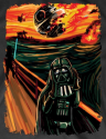


 yes Original Leathermans and probably better quality than the new MTs ???


 :D


Hello! It looks like you're interested in this conversation, but you don't have an account yet.
Getting fed up of having to scroll through the same posts each visit? When you register for an account, you'll always come back to exactly where you were before, and choose to be notified of new replies (either via email, or push notification). You'll also be able to save bookmarks and upvote posts to show your appreciation to other community members.
With your input, this post could be even better 💗
Register Login


