
leatherman logo change
-
I feel like I need to duck as I type this, but “I like it”! [emoji33]. A multitool formed into an L for Leatherman…very thought provoking ;-)

Sent from my iPad using Tapatalk
-
@dmattaponi said:
I feel like I need to duck as I type this, but “I like it”! [emoji33]. A multitool formed into an L.:hug:
-
-
Wait a minute...

Did they change the logo?
Spoiler:
To be honest, I had to go over this topic again to see what my initial response to the changing of the logo was, which kinda shows how trivial things like these actually are... ::)

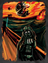
 at first, then later everyone will like it.


 :D



Hello! It looks like you're interested in this conversation, but you don't have an account yet.
Getting fed up of having to scroll through the same posts each visit? When you register for an account, you'll always come back to exactly where you were before, and choose to be notified of new replies (either via email, or push notification). You'll also be able to save bookmarks and upvote posts to show your appreciation to other community members.
With your input, this post could be even better 💗
Register Login


